In this article, we’ll look at how a well-structured, professional corporate identity is crucial for cultivating audience trust.
We are often told that trust needs to be earned. For any relationship to work, the parties must show each other they can be relied upon to show up and take up. That way, trust becomes a consequence of a journey, not an event. It takes time and effort.
But can trust be “constructed”?
Visual designers and marketers try to do that every day. In every piece of branding you interact with — logo design, web design, and even the business card design — painstaking work goes into creating and combining elements that present the brand in the best, most trustworthy light possible.
Of course, the final decision of trusting or not trusting a brand stays with the consumer, yet getting the design right makes the decision a lot easier.
In the Human Resources (HR) realm, where trust is the most valuable currency — employees and employers trust each other to supplement each other’s journey to success — getting the design right becomes crucial. If you have a well-structured, professional corporate identity, you can hope to attract the right talent to your team.
In the discussion below, we detail how that works. We study the HR logo designs of the world’s top three HR companies and learn how they’ve used their logos to cultivate trust in their audiences.
Trustworthiness in Design
We’re told not to judge a book by its cover, but if people listened to this sage advice, book cover designers would have starved. The fact is that human beings are visual beings. We look at stuff and attribute qualities to it. Based on how it looks to us, we decide to trust it or not.
In 1999, Jakob Nielsen of the Nielsen Norman Group talked about how design can communicate trust in four key ways. Harvard Business Review did a famous study in 2019 to find out the most effective and trustworthy types of logo designs. A study published in the Journal of the Society of Telecommunication articulated how colors work as trust cues in online design.
Based on these studies and others, we’ve compiled a list of five factors that a logo design must have to inspire trust in consumers:
- Descriptive design. Your HR logo needs to be descriptive so people know what it’s about. Instead of clever or cryptic imagery, use descriptive visuals to market your HR agency and its services.
- High-quality design. The overall quality of your logo design will help people perceive it as premium, budget, or cheap. To attract the world’s top talent to your team, your HR logo must use the best quality elements in its building.
- Well-organized design. Cluttered and crowded visuals overwhelm and make people disconnect. To attract and engage users, lay out your HR logo in a way where each element has plenty of white space for elbow room, an organized hierarchy so important elements stand out, and a clean overall look so the design looks neat and professional.
- Appropriate design. Choose logo design elements that match the character and core services of your HR agency. A temp HR agency will use design elements (colors, fonts, shapes) vastly different from those adopted by an executive search firm. Understand your target market so you can select design elements that speak to them the most authentically.
- Updated design. Keep your design refreshed and updated. An HR logo design that looks and feels outdated may be perceived to offer archaic employment models. To appeal to talented workers of today, you must have a design identity that they can feel at home with.
Exploring the Logos of Three Top HR Companies
According to Consultantcy.org, the top three HR and consulting firms in the world are Deloitte, PwC, and EY.
Let’s see how these multi-million dollar HR firms use their unique logo design details to position them as trustworthy global human resource leaders.
Note: All brand logos have been sourced from BrandFetch.
Deloitte

Deloitte is often ranked as the number one HR and consultancy firm in the world. Both in terms of revenue and impact, Deloitte has been a powerful name in global circles where talent, consultancy, and employment are mentioned.
Over the years, the company has amassed a wealth of brand trust for itself. Has its logo played any part in this?
The Deloitte wordmark
The Deloitte logo is a wordmark, which is pretty standard and expected of international firms that want to make their brand name, and not any symbol, the focus of user attention. These companies take pride in their name and want to build brand equity around them.
Wordmark logos also create clean and clutter-free brand identities with just the text. Having no other unnecessary elements in the space ensures the wordmark can shine properly and has no competing elements fighting for room.
The sans-serif font
The Deloitte wordmark uses a sans-serif font for its corporate identity. Sans-serif fonts convey professionalism, polish, and ease. As brand identity fonts, sans serifs are the khaki pants on a yacht. They are sophisticated without being too serious, and easy to comprehend and interact with in their appeal.
The color palette
The Deloitte color palette is pretty minimal. The entire logotype is in black with a green dot for effect. The black wordmark allows the brand name to remain visible and recognizable on most backgrounds.
The iconic dot
The brand adopted the green dot during its 2016 rebrand. In the company’s own words, the decision had some people doubting whether the green dot with its strong color personality was at all right for the brand. But it has allowed Deloitte to build on its “connecting the dots” brand message and works as a period after a short, impactful sentence — which is the brand name itself!
In summary, the design choices of Deloitte help people perceive it as trustworthy and reliable. The clean layout and minimalist elements allow users to perceive it as confident and professional. With just a hint of color, the brand manages to convey a human side to it and instantly elevates its HR logo to another level.
PricewaterhouseCoopers (PwC)

After the clean, two-toned logo of Deloitte, the PwC logo looks busy and a bit much. Instead of a subtly confident sans serif or strong serif, the design exists in a small-case lettermark. How does it help the PwC brand?
Remember we talked about trust being a journey and not an event? PwC has a long history of delivering top-notch HR and accounting services to global companies. It boasts an impressive list of clients including ExxonMobil, Chevron, JPMorgan Chase & Co., Bank of America, The Walt Disney Company, and others.
As for its logo, the design details hold a narrative quality. Let’s take a look.
The PwC lettermark
The PwC logo is a lettermark logo design style where companies with long or complicated brand names use their brand initials or acronyms as their brand logos. Audiences respond favorably to lettermarks when a bit of trust already exists in the relationship, which is the case here.
The serif font
The PwC lettermark is a serif typeface ideal for traditional and legacy businesses. People associate serif fonts with trust and reliability as they were the first fonts used in journalistic publications.
The color palette
The logo design uses a multi-color palette of vibrant red, orange, yellow, and pink. The lettermark stands strong in all-black and provides a clear contrast. While different from traditional consulting brand logos that favor muted color schemes, the PwC logo stands out as being assertive and unruffled.
The JENGA® icon
PwC uses a building blocks icon very similar to the popular stacking game JENGA. The icon symbolizes the PwC teams “working together to a common goal – fitting together the various pieces to form a structure that doesn’t falter.”
Overall, the design choices in the PwC logo, while contrasting with tradition, allow PwC to stand as a brand that knows what it’s doing and garners trust by being open and confident.
Ernst & Young
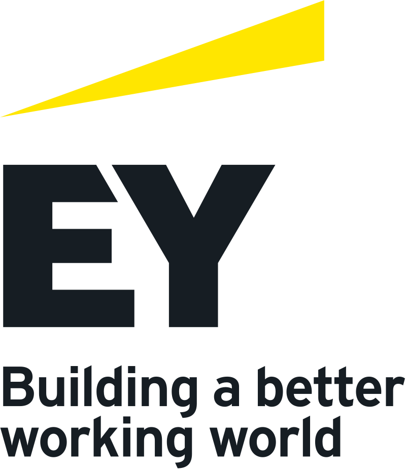
As the third most powerful and influential consulting firm in the world, Ernest & Young sports a dynamic and provocative brand identity. It’s sleek, modern, and has a bit of character. Somewhat different than both the Deloitte and PwC logos, the EY logo falls somewhere in the middle.
It has more personality than the Deloitte logo but is not as flagrant as the PwC mark.
Let’s see if it has what it takes to generate trust in its audiences.
The EY lettermark
The brand has moved from a wordmark logo marketing its full name to a shorter and sharper lettermark. Before the change, audiences were always conflicted about whether to call the company EY or E&Y. The change addressed the confusion and brought harmony to the logo. Since the redesign addressed a common doubt, clearing it has helped the logo design appear more trustworthy and informative to the public.
The display font
The logo uses a display sans-serif font, and these are generally the best fonts for logo designs. They are large, blocky, and command attention. The display font used in the EY lettermark adds authority to the design and helps it be perceived as strong and reliable.
The color palette
The primary color palette of EY is minimal and flat. It’s a deep and rich black with only a splash of yellow that adds some energy to it. While the choices earned the company some flack when the redesign was first unveiled, the logo has aged fine. The black is unproblematic and sturdy, while the warm accent makes the design more human and authentic.
The dashing yellow
The yellow detail on top of the Ernest & Young logo prevents the design from looking too bland. Remember that people associate humanistic and psychological qualities with color. An all-black logo may seem neutral but neutrality doesn’t beget trust. The streak of bright and warm yellow adds some verve to the logo design, allowing audiences to look at it with optimism and hope.
In the end, the final look of the EY logo is one of assured zest. The company uses the logo to position itself as a leader in the sphere with lots of human connections and activity to offer.
Building Brand Trust through Brand Logos
Brand logos have never been empty symbols. Throughout history, they have served as meaningful icons of trust and authority. Whether functioning as seals on economic currencies or a coat of arms on a royal shield, logos or emblems help inspire trust in people and bring them toward a common goal.
So why should your HR logo act any differently?
As an employment agency that has a significant part to play in people’s livelihoods and career aspirations, you have an immense responsibility to communicate a clear brand identity to your consumers. Through fonts, colors, icons, and overall quality, you hold the power to tell your brand story to its maximum effect.
While it’s true that trust can only be earned through a long process of honesty, transparency, and dependability, tools like logo designs are there to help you build a path to it.
Since people are so quick to judge based on simple visuals, there’s worth in creating visuals that help them judge in your favor.
 Evan Brown
Evan is a distinguished expert in digital marketing, boasting over 15 years of experience in the dynamic world of social media. Since 2008, he has honed his skills in design services, user interface planning, and branding, making him a sought-after authority in these fields. As a seasoned design professional, Evan has a keen eye for aesthetics and a passion for DIY design projects, consistently delivering innovative and impactful solutions. His extensive knowledge and creative prowess have earned him a stellar reputation in the industry, setting him apart as a leader in digital marketing and design. Additionally, Evan is the in-house wordsmith and blogger at DesignMantic, where he shares his insights and expertise with a wide audience.