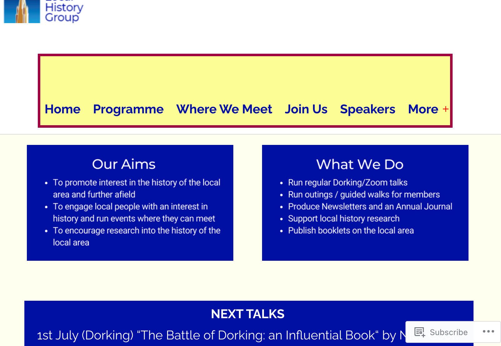
I maintain a WordPress website for a local history group, www.dlhg,org.uk
Until recently, I think it looked the same on Chrome, Firefox, or MS Edge.
Now, it’s displaying correctly on Firefox/Edge, but the “sticky header” at the top of the page is much smaller in Chrome, resulting in the image at the lop left hand of the screen being truncated.
I’ve used the “inspect” feature to try to pinpoint what’s happening, but haven’t succeeded. Could anyone help?
The CSS for this webpage is messy, it’s grown like topsy with several people adding lines of code - I please see below.
All ideas welcome!
This is quite a small issue, but I’m trying to get the hang of CSS, so I’d like to fix it.
CSS CODE
/* New classes for this website /
.EventText1 {
line-height: 1.25;
}
.EventText2 {
line-height: 1.5 !important;
}
.EventText3 {
line-height: 3;
}
.EventBox {
border: 1px solid black;
}
.RedEventBox {
border: 2px solid #A30042;
text-align: center;
}
.SpeakerBox {
border: 1px solid grey;
vertical-align: middle;
padding-top: 4px;
padding-bottom: 4px;
padding-left: 6x;
padding-right: 4px;
}
.EmphasizeGroup1 {
color: #0330fc;
font: Gill Sans;
background-color: #faec93;
border-color: #5c70ed;
border-style: solid;
padding: 10px;
}
.EmphasizeGroup2 {
color: #0330fc;
font: Gill Sans;
background-color: #ffd9ad;
border-style: dashed;
border-color: #5c70ed;
padding: 10px;
}
/ overrides on standard Css cclasses */
.small-title {
background-color: #ffd9ad;
font-weight: bold;
color: #fff;
font-size: 16px;
padding: 10px;
}
.entry-title h1 {
font-size: 18px;
}
h1 {
font-weight: bold;
color: #000FA3 !important;
font-size: 18px;
padding-top: 1px;
padding-bottom: 1px !important;
text-align: center;
}
h2 {
font-weight: bold;
font-size: 15px;
color: #000FA3;
padding-top: 5px;
padding-bottom: 5px;
}
div {
padding-top: 2px;
padding-bottom: 2px;
padding-left: 2px;
padding-right: 4px;
}
.primary-navigation {
background-color: #FDFD96;
border: 4px solid #A30042;
color: red;
}
.main-navigation li.menu-item a {
color: #fff;
}
.menu-button-container {
color: red;
}
.singular .entry-header {
border-bottom: none !important;
margin-bottom: 0 !important;
padding-bottom: 10px !important;
}
.site-header {
max-width: 1800px !important;
padding-right: 20px;
}
#primary-menu-list li a {
color: #000FA3;
font-weight: bold;
/* font-size: 16px !important; */
padding-left: 10px;
padding-right: 10px;
}
.primary-navigation {
padding-left: 10px;
padding-right: 10px;
padding-top: 60px;
}
button.sub-menu-toggle {
width: 20px !important;
}
.Cabin {
font-family: Cabin;
}
nav#site-navigation {
margin-right: auto !important;
}
.site-header {
background: #ffff;
z-index: 999;
margin: 0 auto;
border-bottom: 1px solid #dadada;
width: 100%;
position: fixed;
top: -115px;
left: 0;
right: 0;
}
.entry-header {
padding-top: 50px;
}
.entry-content {
padding-top: 50px;
}
/* Fix Android menu bugs */
@media only screen and (min-width: 482px) {
.site-header {
padding-bottom: 10px !important;
}
}
title {
padding-top: 5px;
padding-bottom: 5px;
}
@media only screen and (max-width: 481px) {
.menu-button-container {
position: fixed;
padding: 0;
top: 15px;
}
.admin-bar .menu-button-container {
	top: 120px;
}
}
