- Key Takeaways
- Getting Started with Grid Layout
- Setting a Gap Between Grid Items
- Setting Up Grid Columns
- Organizing Grid Items into Rows and Columns
- Placing Grid Items on the Grid
- Placing Grid Items Using Named Grid Lines
- Placing Grid Items Using Named Grid Areas
- Using Media Queries with Grid Layout
- Changing the display order of grid items
- Responsive Grid Layout without Media Queries
- Overlapping Elements in a Grid
- Wrapping Up
- FAQs About CSS Grid Layout
The CSS Grid Layout Module has revolutionized the way websites are built. It offers tools that allow for advanced layouts without the tricky hacks and inventive solutions of the past.
In this introduction to Grid, we’ll walk through the basics of how Grid layout works, and we’ll look at lots of simple examples of how to use it in practice.
Key Takeaways
Getting Started with Grid Layout
A grid is a framework of columns and rows into which we can place content. (It’s a bit like a table layout, but on steroids!)
Getting started with Grid is as simple as doing this:
.container {
  display: grid;
}
Now, all of the direct children of the .container element will be “grid items”. To start with, they’ll just appear as a bunch of rows in a single column, as shown in the demo below.
See the Pen
CSS Grid Basics: display: grid by SitePoint (@SitePoint)
on CodePen.
In the example above, we have a <div> element that acts as the container. Inside it we have several elements, which are now grid items:
<div class="container">
  <header>header</header>
  <aside>aside</aside>
  <main>main</main>
  <footer>footer</footer>
</div>
So far, we haven’t achieved much, as we would get the same result without display: grid.
Further reading:
- In the demo above, the container is centered in the viewport. Read more about centering elements with Grid.
Setting a Gap Between Grid Items
Let’s first space our divs apart a bit with the gap property:
.container {
  display: grid;
  gap: 10px;
}
See the Pen
CSS Grid Basics: gap by SitePoint (@SitePoint)
on CodePen.
The gap property inserts space between the elements vertically and horizontally, as we’ll see shortly. (We can set different horizontal and vertical gaps if we need to.)
Further reading:
- Read more about the gap property.
Setting Up Grid Columns
Currently, we have an “implicit” grid — meaning that the browser is just figuring out a grid for itself, as we haven’t specified any rows or columns yet. By default, we just get one column and four rows — one for each grid item. Let’s now specify some columns:
.container {
  display: grid;
  gap: 10px;
  grid-template-columns: 1fr 1fr 1fr 1fr;
}
With grid-template-columns, we’re specifying that we want four columns each with a width of 1fr, or one fraction of the available space. (Instead of 1fr 1fr 1fr 1fr we could write repeat(4, 1fr) using the very handy repeat() function.)
Now our grid items are laid out in one row, as shown below.
See the Pen
CSS Grid Basics: grid-template-columns by SitePoint (@SitePoint)
on CodePen.
Further reading:
- Further information on grid-template-columns.
- Learn more about the flexible length (fr) unit.
- How to use Grid’s repeat() function.
Organizing Grid Items into Rows and Columns
Now let’s organize our grid items into rows and columns, as we might see them on a standard web page layout.
Firstly, we’ll specify three rows with the grid-template-rows property:
.container {
  display: grid;
  gap: 10px;
  grid-template-columns: 1fr 1fr 1fr 1fr;
  grid-template-rows: auto auto auto;
}
If we add that line to the Pen above, not much will happen yet, as we haven’t specified how we want our grid items to fit into these rows and columns. (Again note that auto auto auto could be written as repeat(3, auto) using the repeat() function.)
Further reading:
- Further information on grid-template-rows.
- How to use Grid’s repeat() function.
Placing Grid Items on the Grid
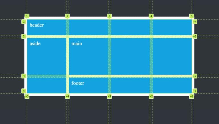
Our browser’s developer tools come in very handy for understanding CSS Grid layout. If we inspect our code so far, we can see the horizontal and vertical grid lines that define our grid, as pictured below.

There are five vertical grid lines and four horizontal grid lines, all of them numbered. We can use these grid lines to specify how we want our grid items laid out.
Let’s first set the <header> element to span the four columns and one row:
header {
  grid-column: 1 / 5;
  grid-row: 1;
}
This tells the <header> to start at the grid column line numbered 1 and end at the column line numbered 5.It also tells the <header> to start at the first grid row line. Because an end line isn’t specified, it just spans to the next row line, so grid-row: 1 is equivalent to grid-row: 1 / 2.
Let’s do something similar to the <footer>:
footer {
  grid-column: 1 / 5;
  grid-row: 3 / 4;
}
The only difference here is that we’ve set the <footer> to sit between grid row lines 3 and 4.
Now let’s position the <aside> and <main> elements:
aside {
  grid-column: 1 / 2;
  grid-row: 2 / 3;
}

main {
  grid-column: 2 / 5;
  grid-row: 2 / 3;
}
The result is shown in the Pen below.
See the Pen
CSS Grid Basics: Placing items with numbered lines by SitePoint (@SitePoint)
on CodePen.
We now have a flexible and responsive layout without hacky floats, overflows and other nightmares of the past. If we add content to our grid items, they’ll expand to contain that content, and the side-by-side columns will always have equal height. (For those working with CSS in the noughties, achieving equal-height columns was a nightmare!)
Useful things to know about numbered grid lines
If you look again at the image above, you’ll see that, along the bottom, the vertical lines are also named with negative numbers. Each grid line has a positive and a negative number. This has lots of uses, such as when there are lots of grid lines and we don’t necessarily know how many there will be. We could set our <header> element to span all five columns with grid-column: 1 / -1, as the last vertical line is numbered both 5 and -1.
Grid also has a span keyword, which we can use to tell an element to span a number of rows or columns. Another option for our <header> layout would be to write grid-column: 1 / span 4. This tells the element to start at the first grid line and span across all of our four columns.
Try out these variations in the Pen above.
Further reading:
- Learn more about grid lines.
- The direction in which grid lines are numbered is affected by our layout’s writing mode.
- Learn more about grid-column.
- Read about the span keyword in the Grid specification.
Placing Grid Items Using Named Grid Lines
We’ve seen how to organize elements on the grid using numbered grid lines. But we can also give names to some or all of our grid lines and reference those instead — which can be a bit more intuitive and save us from counting grid lines.
Let’s update our layout to include some named lines:
.container {
  display: grid;
  gap: 10px;
  grid-template-columns: [aside-start] 1fr [main-start] 1fr 1fr 1fr [main-end];
  grid-template-rows: auto auto auto;
}
In the code above, we’ve named just three vertical grid lines. The names go in square brackets beside our column widths, representing our column lines.
We can now place some of our elements on the grid like so:
header, footer {
  grid-column: aside-start / main-end;
}

aside {
  grid-column: aside-start; /* will just span one column by default */
}

main {
  grid-column: main-start / main-end;
}
We can see this code in practice in the demo below.
See the Pen
CSS Grid Basics: Placing items with named lines by SitePoint (@SitePoint)
on CodePen.
Further reading:
- Learn more about named grid lines.
- Read about named lines in the Grid specification.
Placing Grid Items Using Named Grid Areas
One of the most interesting and “designer-friendly” features of Grid layout is the ability to name grid areas — that is, one or more cells in the grid — in a simple and intuitive way, and then use those names to lay out our grid items. It works like this:
.container {
  display: grid;
  gap: 10px;
  grid-template-columns: 1fr 1fr 1fr 1fr;
  grid-template-rows: auto auto auto;
  grid-template-areas:
            "header header header header"
            "aside  main   main   main"
            "footer footer footer footer";
}
Using grid-template-areas, we’ve drawn up a simple text grid specifying how we want elements laid out. Now we just need to apply these area names to our elements:
header {
  grid-area: header;
}

aside {
  grid-area: aside;
}

main {
  grid-area: main;
}

footer {
  grid-area: footer;
}
So, the <header> will span all four columns, the <aside> element will just sit in the first column of the second row, and so on.
We can see this in action in the Pen below.
See the Pen
CSS Grid Basics: Placing items using names areas by SitePoint (@SitePoint)
on CodePen.
This code is a lot simpler than what we had earlier — whether using numbered or named lines. Using named grid areas like this is almost embarrassingly simple — like using a WYSIWYG editor instead of writing real code. But be assured, it’s not cheating! It’s just super cool.
Using line numbers and named lines with grid areas
It’s worth noting that we can also use line numbers and/or named lines to define grid areas. For example, instead of using the grid-template-areas property, we could just do something like this:
header {
  grid-area: 1 / 1 / 2 / 5;
}

main {
  grid-area: 2 / 2 / 3 / 5;
}
The pattern is row-start / column-start / row-end / column-end. You can check out a demo of this on CodePen. Personally, I find it really hard to remember this pattern of rows and columns, but the great thing about Grid is that there are lots of ways to do the same thing.
Changing the layout of grid items
In days of old, if we decided at some point to change the layout of our page elements, it would likely have led to a lot of code refactoring. For example, what if we wanted to extend the <aside> element down to the end of the layout? With grid areas, it’s super easy. We can just do this:
.container {
  grid-template-areas:
            "header header header header"
            "aside  main   main   main"
            "aside  footer footer footer";
}
We’ve just removed a grid cell from footer and assigned it to aside, leading to what we see in the Pen below.
See the Pen
CSS Grid Basics: Placing items using named areas 2 by SitePoint (@SitePoint)
on CodePen.
We might even decide that we want an empty cell somewhere. We do that by just using one or more periods, like so:
.container {
  grid-template-areas:
            ".      header header header"
            "aside  main   main   main"
            "aside  footer footer ......";
}
See if you can predict the outcome of this, and then check out this CodePen demo.
Further reading:
- Learn more about grid-template-areas.
- Learn more about the grid-area property.
Using Media Queries with Grid Layout
We often want a different layout on small screens — such as stacking our grid elements in a single column. An easy way to do this is to reorder our grid areas via a media query:
@media (max-width: 800px) {
  .container {
    grid-template-columns: 1fr;
    grid-template-areas:
              "header"
              "main"
              "aside"
              "footer";
  }
}
We’ve now specified just a single column, and set the order of the elements in that column.
See the Pen
CSS Grid Basics: Using media queries by SitePoint (@SitePoint)
on CodePen.
Press the 0.5x button at the bottom the Pen above to see how the layout responds (or view the Pen on CodePen and widen and narrow the viewport).
Changing the display order of grid items
We’re at a good point now to see how easy it is to change the display order of elements in Grid layout. In the example above, our source order is <header>, <aside>, <main> and <footer>, but in our media query we’ve set the <main> element to appear above the <aside> element. It’s that easy to swap around the display order of elements with Grid! We could even completely reverse the display order of all of them.
We can reorder grid elements even if not using named elements. By default, grid items are placed according to their HTML source order. They also have a default order of 0. We can use this order property to change the visual arrangement of elements. The lower the order value, the sooner an element appears. Even negative integers can be used, so if our <main> element had an order of -1, it would appear first.
To order our elements as shown above, we could set the order value of <main>, <aside> and <footer> to 1, 2 and 3 respectively. (Check out this Pen for a live demo.)
A word of caution, though: reordered elements can be a nightmare for accessibility, with the focus jumping around the screen unpredictably, so use it sparingly.
Further reading:
- The official specification for the order property.
- The
orderproperty explained on MDN, including a section on accessibility concerns.
Responsive Grid Layout without Media Queries
We saw above that we can make our layout responsive to different screen sizes. Firstly, by setting column widths to flexible units like fr, the layout can grow and shrink as needed. Secondly, we can use media queries to reorganize the layout at certain breakpoints.
Grid layout has tools that allow for layout reflow without the use of media queries. However, we can’t achieve this with the layout we’ve been working with above. It only works for simpler layouts where each column shares the same width.
Consider the following HTML:
<article>
  <div></div>
  <div></div>
</article>
Let’s sit those divs side-by-side on wide screens, and stack on small screens:
article {
  display: grid;
  gap: 10px;
  grid-template-columns: repeat(auto-fit, minmax(min(250px, 100%), 1fr));
}
You can see the result in the Pen below.
See the Pen
CSS Grid Basics: responsive grid without media queries by SitePoint (@SitePoint)
on CodePen.
(Again, press the 0.5x button at the bottom the Pen above to see how the layout responds.)
That code is a bit more advanced, and we explain it in detail in How to Use the CSS Grid repeat() Function. The main purpose of showing it here is to give a sense of what’s possible with Grid layout.
Further reading:
- Read more about the auto-fit keyword.
- Read more about using the minmax() function with the min() function.
Overlapping Elements in a Grid
Once we’ve created a grid layout, we can do more than just allocate each grid item to its own separate grid area. We can easily set grid items to share the same grid areas, in part or in full. This allows us to create beautiful, creative layouts — with overlapping elements, and without any tricky code.
Let’s create a simple grid containing an image and some text that partly covers the image. Here’s the HTML:
<article>
  <img src="village.jpg">
  <div>The beautiful village of Oia, on the island of Santorini, Greece</div>
</article>
Now we’ll assign some rows and columns that are partly shared between the div and the image:
article {
  display: grid;
  grid-template-columns: 1fr 2fr 1fr;
  grid-template-rows: 2fr auto 1fr;
}

img {
  grid-column: 1 / 3;
  grid-row: 1 / 4;
}

div {
  grid-column: 2 / 4;
  grid-row: 2;
}
The result is shown in the following CodePen demo.
See the Pen
CSS Grid Basics: Layered grid elements by SitePoint (@SitePoint)
on CodePen.
The div appears above the image simply because it comes after the image in the source order. We can change which element appears over the other by applying z-index. For example, try setting a z-index of 2 to the image in the Pen above; it will now cover part of the div.
Further reading:
- To understand the positioning of the image in the demo above, check out How to Use CSS object-fit and object-position.
- Learn more about the z-index property.
Wrapping Up
This article is intended just as a basic introduction to what CSS Grid layout can do. The hope is that it will provide a springboard for further learning and discovery. And there’s a huge amount you can learn about Grid.
Grid vs Flexbox
An eternal question is whether we should use Grid or Flexbox. It’s true that there is some overlap between what these two layout tools can do. Often, where there is overlap, it’s worth doing a few tests to see which has the better toolkit in each particular scenario.
As a general rule, though, remember this:
- Flexbox is mainly designed for laying out elements in a single direction (even if those elements wrap across lines).
- Grid is designed for laying out elements in two directions, so that they’re aligned both horizontally and vertically.
For this reason, Grid is generally a better option for whole-page layouts, while Flexbox is better for laying out things like menus.
For a more in-depth comparison of Grid and Flexbox, check out Flexbox or CSS Grid? How to Make Layout Decisions that Make Sense.
Browser support for Grid
When we first published this article — back in 2016 — Grid was fairly new to browsers, and support wasn’t universal. Nowadays, all the major browsers support Grid. There will still be a few older browsers floating around that don’t support it, but in many cases, those browsers will still display the content well enough. One nice catch-all approach is to start with a single-column layout for mobile devices that can serve as a fallback for browsers that don’t support Grid layout. The Grid styles can be added in via media queries for browsers that do support them — to be displayed on wider screens.
You can check out the latest browser support for Grid on caniuse.
Learning resources for Grid
Finally, let’s end with some further learning resources. Lots of amazing people have provided tutorials, videos, books and more on Grid. Here are just a few:
- CSS Master, 3rd Edition, by Tiffany Brown, is a great introduction to CSS, with in-depth guidance on how to use Grid and other layout methods.
- The MDN Grid reference.
- The Grid by Example site of Rachel Andrew. (Actually, Rachel Andrew has lots of incredible articles, tutorials, videos and even a book on Grid layout, and is a foremost expert on it. Googling “Rachel Andrew Grid” will bring up tons of great material for learning Grid.)
- The Layout Land YouTube series by Jen Simmons. (Jen is another name worth googling.)
- Kevin Powell presents lots of fantastic Grid tutorials on YouTube that are worth checking out.
- CSS-Tricks provides A Complete Guide to CSS Grid, which is a really handy resource.
FAQs About CSS Grid Layout
What is CSS Grid Layout?
CSS Grid Layout is a layout system in CSS that allows you to create complex two-dimensional grid-based layouts for web pages. It provides a more flexible and efficient way to design and position elements in a grid.
How do I enable CSS Grid on my webpage?
To enable CSS Grid, you can use the display: grid; property in your CSS code. This will make the selected container a grid container.
What are the main components of CSS Grid?
The main components of CSS Grid are the grid container and grid items. The container is defined using the display: grid; property, and the items are the elements placed inside the container.
How do I define rows and columns in a CSS Grid?
You can define rows and columns by setting properties like grid-template-rows, grid-template-columns, or using the shorthand property grid-template.
Can I have different column widths and row heights in a CSS Grid?
Yes, you can specify different column widths and row heights by using different values in your grid-template definition, such as fixed lengths, percentages, or the fr unit for flexible sizing.
Can I nest grids within grids?
Yes, you can nest grids within grids, creating complex layouts by making a grid item itself a grid container.
Is CSS Grid responsive? Can I make grids adapt to different screen sizes?
Yes, CSS Grid can be responsive. You can use media queries, percentages, or relative units to adapt your grid layout to different screen sizes and devices.
 Ralph Mason
Ralph is a production manager at SitePoint and a freelance copyeditor, web designer and teacher at Page Affairs.


