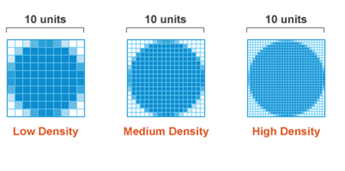
As many people use their highly portable devices for work and play, device manufacturers seek to enhance their user experience, making their devices simultaneously more powerful and easier to use. Apple gave us a completely new line-up of products that introduced double density pixel screens, creating sharper images on smaller screens. Other device manufacturers are following suit with their own version of high pixel density screens. While this is undoubtedly a boon for consumers and end users, it can present a challenge to web developers and designers to make their websites and apps compatible with such Retina displays. It was then that web developers realized how old fashioned the web is and how websites looked “non-living” on such displays.
Does this mean websites look broken on such devices?
No, the websites are not broken on Retina devices. They just look fuzzy and pixels start appearing on low resolution images. The overall structure of the website remains same.Pixels and Screen Density
When we speak about pixels, they are nothing but the smallest physical unit in a display. It is a minute area of illumination which when combined with many other pixels form an image. Each pixel has its own brightness level and colors standard as instructed by the operating system. It is the imperceptible distance between two pixels that makes the image look sharper and bright. Screen density on the other hand refers to the total number of such pixels that physically appear on a display screen. It is generally measured in pixels per inch format popularly known as PPI. The term Retina mentioned in the title of this post is a friendly word used by Apple to lay emphasis on the double density pixels screen of its devices. On such high resolution display screens like of Retina Ipad and MacBook Pro, it is nearly impossible for a human eye to see the pixels from a normal viewing distance.CSS Pixel
CSS pixel is an abstract unit used by the browsers to draw images and other content on a web page. CSS pixels are DIPs which means they are device independent pixels. They readjust themselves according to the pixel density of the screen they are rendered in. If we have the following piece of code:<div style=”width:150px; height:200px”></div>
The above HTML component would look 150px by 200px in size in a standard display while 300px by 400px in a Retina display to retain the same physical size.

Resizing Images
1) Using alternate high resolution pixels
Suppose we have an image of 200px by 400px (CSS pixels) and we want to display it properly in a Retina display. We can upload an alternate image of size 400px by 800px in our server and render them whenever the webpage is opened in a Retina device. But to make them appear physically of the same dimensions we have to use CSS to resize them. The following is the piece of code that explains this./* for low resolution display */
.image {
background-image: url(/path/to/my/lowreslogo.png);
background-size: 200px 300px;
height: 300px;
width: 200px;
}
/* for high resolution display */
@media only screen and (min--moz-device-pixel-ratio: 2),
only screen and (-o-min-device-pixel-ratio: 2/1),
only screen and (-webkit-min-device-pixel-ratio: 2),
only screen and (min-device-pixel-ratio: 2) {
.image {
background: url(/path/to/my/highreslogo.png) no-repeat;
background-size: 200px 400px;
/* rest of your styles... */
}
}2) Using @face-fonts instead of images icon
If you are displaying a large number of icons in your webpage, then resizing each on them with a double resolution icon will be a hectic job. We will try to use @font-faces instead of images. These image fonts will automatically resize themselves on the high resolution devices just like normal fonts do. Using @face-fonts is an alternate solution to Bitmap icons. Today, there are many good quality icon fonts that can meet your requirements for website design. Examples of such fonts are Fontello and Inkscape. The following code shows how to use @font-faces as a replacement to image icons:In HTML:
/* define span tag for letters and give them a class in HTML */

<span class=”myicon”>d</span>
In CSS:
/* First import your font */

@font-family: myFont;

src: url('Modern_Icons.ttf'),

     url('Modern_Icons.eot'); /* IE9 */

. myicon {

    font-family: ‘Modern Icons’;

}
3) Using SVG images instead of Bitmap images
Bitmap images are raster images that multiply their pixels in Retina displays. But they come with a limitation of getting multiplied infinite number of times. This is where SVG images come to role. They also solve our problem of uploading alternate images of double resolution plus they solve the bandwidth problem too!In HTML:
<img src="example.svg" width="150" height="200"/>
In CSS:
.image {

    background-image: url(example.svg);

    background-size: 150px 200px;

    height: 150px;

    width: 200px;

}
4) Using JavaScript to replace all the images with double sized image
As mentioned, replacing low resolution images with double resolution images consumes extra bandwidth and the website will load slowly. Still, if you want to go with the first method as discussed above, then replacing each one of them by writing individual code will be a difficult task. We can use JavaScript to replace all images in a webpage. The following code explains this.$(document).ready(function(){
if (window.devicePixelRatio > 1) {
var lowresImages = $('img');
images.each(function(i) {
var lowres = $(this).attr('src');
var highres = lowres.replace(".", "@2x.");
$(this).attr('src', highres);
});
}
});myimage.png and high resolution images as myimage@2x.png. It finds the first dot in the image name and replaces it with myimage@2x.
One of the major disadvantages of using the above JavaScript method is that the Retina display device would have to download both versions of images every time the page loads. This will surely affect the loading time of your website.
In my opinion, you must go with vector images method (SVG) as their size is low. For icon images you can use @font-faces method. These two methods will definitely make your website shine and lively in Retina devices.
Working with high resolution favicons
Today favicons are used in multiple purposes both in standard devices as well as Retina displays. Favicons are used as bookmarks on home screen in Apple devices. So they have to be of better quality. You can export both 16px and 32px versions to make a favicon Retina ready. Use Apple’s Icon composer, Graphic Tools in XCode, for a good Retina favicon.Conclusion
The web is undergoing a transformative phase in which websites are made ready for such Retina displays. This transformation is slow but an effective approach to make visitors happy with the content. As web designers we have to use the above CSS techniques to make websites ready for high resolution display screens. And if you enjoyed reading this post, you’ll love Learnable; the place to learn fresh skills and techniques from the masters. Members get instant access to all of SitePoint’s ebooks and interactive online courses, like HTML5 & CSS3 For the Real World. Comments on this article are closed. Have a question about CSS? Why not ask it on our forums?Frequently Asked Questions (FAQs) about CSS Techniques for Retina Displays
What is a Retina Display and how does it affect web design?
A Retina Display is a term coined by Apple to describe screens that have a high pixel density, making it impossible for the human eye to discern individual pixels at a normal viewing distance. This results in sharper images and text. For web design, this means that images and graphics need to be higher resolution to look crisp and clear on these displays. If not, they may appear blurry or pixelated.
How can I make my website images look sharp on Retina Displays?
To make your website images look sharp on Retina Displays, you need to use high-resolution images that are twice the size of the space they will occupy on the screen. Then, you can use CSS to scale down the image to the correct size. This technique is known as serving “2x” images.
What is a CSS media query for Retina Displays?
A CSS media query for Retina Displays is a piece of code that allows you to apply different CSS styles depending on the pixel density of the user’s screen. This can be used to serve high-resolution images to devices with Retina Displays, while serving standard-resolution images to devices with lower pixel densities.
How can I use CSS to serve different images to different devices?
You can use CSS media queries to serve different images to different devices. By specifying a minimum device pixel ratio in the media query, you can target devices with high pixel densities, such as Retina Displays, and serve them a high-resolution image.
What is the difference between physical pixels and CSS pixels?
Physical pixels are the tiny dots of light that make up a screen, while CSS pixels are a unit of measurement used in web design. On a standard display, one CSS pixel is equal to one physical pixel. However, on a Retina Display, one CSS pixel is equal to two physical pixels.
How does pixel density affect the appearance of my website?
Pixel density affects the sharpness and clarity of images and text on your website. On devices with high pixel densities, such as Retina Displays, low-resolution images may appear blurry or pixelated. To ensure your website looks good on all devices, you should use high-resolution images and CSS techniques to serve the appropriate image based on the user’s device.
What is the role of viewport in responsive design for Retina Displays?
The viewport is the visible area of a webpage on a device’s screen. In responsive design, the viewport is used to determine how to scale and size elements on the page. For Retina Displays, you can use the viewport to serve high-resolution images that look sharp and clear.
How can I test my website on a Retina Display if I don’t have one?
If you don’t have a device with a Retina Display, you can use tools like the Google Chrome Developer Tools to simulate a high-resolution display. This allows you to see how your website will look on a Retina Display and make any necessary adjustments to your CSS.
Can I use SVGs instead of bitmap images for Retina Displays?
Yes, SVGs (Scalable Vector Graphics) are a great option for Retina Displays because they are resolution-independent and will look sharp on any screen. However, SVGs are best for simple graphics and may not be suitable for complex images or photographs.
What are some best practices for designing for Retina Displays?
Some best practices for designing for Retina Displays include using high-resolution images, serving different images to different devices using CSS media queries, using SVGs for simple graphics, and testing your design on a variety of devices and screen resolutions.
 Syed Fazle Rahman
Web Designer with over 6 years of experience, including user experience and front end development. Currently, CEO and Co-Founder of Hashnode, a network of software developers. Has published two books: Jump Start Bootstrap and Jump Start Foundation for SitePoint Premium.

