What Are Design Systems?
Steve Jobs, Uninteresting Questions, and Design Systems
Author: Alex Walker
Of all the things Steve Jobs was well known for, perhaps the most mundane was his approach to fashion. A plain black turtleneck and faded Levis.
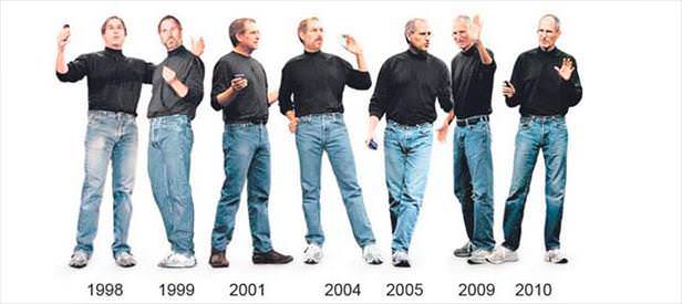
In the late 90’s Jobs originally planned to clothe all Apple employees in a company-wide uniform before getting a firm “ I don’t think so, Steve ” from senior staff. Nevertheless, he personally stuck with the idea for the rest of his life.
Although there’s no doubt it became his ‘brand’, it also had a hidden payoff. Steve didn’t have to spend time and creative energy every morning on what was an an uninteresting question for him. “What should I wear today?”. It just worked every day. Next problem please.
His underlying ethos might have been something like “Save your best thinking for the important bits”.
So, what are the ‘uninteresting questions’ in UI design? Perhaps:
How much margin-top should my H1 have?
How much bigger should my H4 be compared to my body text?
How much bigger should my H3 be compared to my H4?
There are definitely wrong answers to these questions – for instance ‘47 miles’. But there are no un-equivocally correct answers.
I call these the ‘ 1-pixel jog ’ questions – we’ve all sat there in Sketch jogging a font-size from 15px to 16px…and back again…and back again.
‘Design Systems’ are a way to take care of those uninteresting questions and let you focus on the bits that really make a difference.
Does SitePoint have a functional Design System?
Not yet – but we have the foundations: Scaling typography and a grid. Let's talk about what we have and why they're great places to start.
Typography Scales
How do you decide on the relative sizing of text and headings? We’re designers, so our designey spider-senses tell us ‘ …17px?.. No… 18px? … nearly… 19px… hmmm… Yeah! High-5 emojis all round! ’.
And that’s perfectly fine – but it does require a lot of manual work. Why not let math do the grunt work.
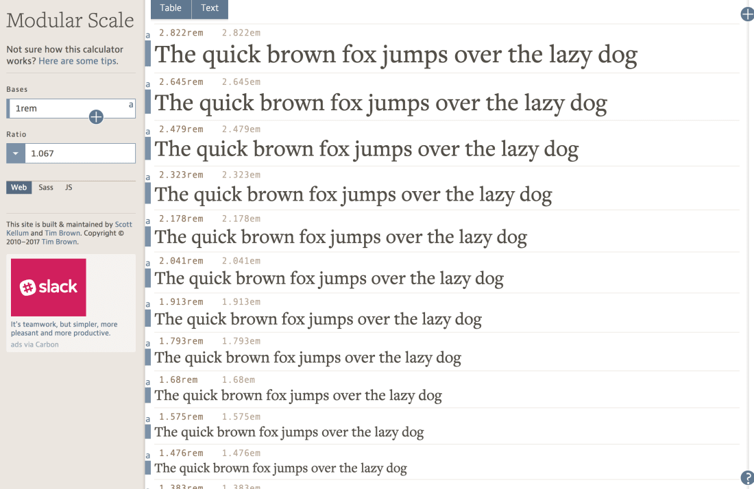
Modular scaling typography works like a musical scale for type – every heading is a set percentage bigger than the preceding one. Our SitePoint system uses 1.25 as that scaling ratio. Even if you don’t know Sass, you probably get the idea of what’s going on below.
p { font-size: 1rem; }h4 { font-size: 1rem * 1.25; }h3 { font-size: 1rem * 1.25 * 1.25; }/* And so on */...Of course, dial up your scaling ratio from 1.25 to 1.35 and your H1 text will be proportionally larger – a little more 'newspapery'. Dial it back to 1.1 and your type will look a little more bookish.
Regardless of the ratio you choose, there is always a natural balance and harmony to these type settings. These high-quality, yet easy, decisions are at the core of all design systems.
Want to experiment with Typography Scales?
Easy: there are a number of tools that let you play with type ratios.
Modularscale.com is probably the most comprehensive type ratio tool around, offering about 25 ‘type steps’. This is probably more than I need, but it’s nice to know it’s there.
You’ll also notice that their ratios are expressed using musical scales – ‘major-seconds’, ‘minor-thirds’ and ‘perfect fifths’.
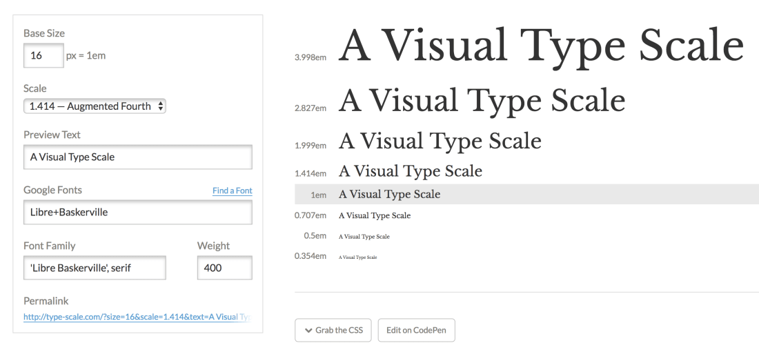
Type-scale.com only sets eight type sizes, but I’ve found that to be more than enough in practice. Both tools allow to export and share type combinations. Type-scale also allows you to send your selection to CodePen, which is a nice feature.
OK, but I like designing in Sketch/Figma/Adobe XD..
Sure you do, and there's nothing wrong with that.
But keep in mind that ultimately your work is presented in browsers with HTML. What looks clean and legible in your crisp design tool doesn't always look the same in your garden-variety browser. Creating your core type set-up in a web browser with a browser-based tool, and then recreating them in Sketch/Figma/AdobeXD is a great way to start your proper 'designing'.
Systems of a Down | Design Systems Examples
All the competition you'll be dealing with
So far this month I’ve outlined design systems from my (or SitePoint designer Alex Walker’s) point of view. But you may be asking yourself, is this actually a thing? Today we’ll take a look at examples of companies using design systems. If you’re thinking of building your own, and I hope you are, I hope they’re inspiration and not intimidation! On that last point, they all have really intense names, so if you feel a little intimidated that’s OK too.
The BBC’s Gel is probably the canonical example of a design system [bbc].
BuzzFeed has Solid [solid.buzzfeed].
Shopify has Polaris [polaris.shopify].
Salesforce has Lightning [developer.salesforce].
Zendesk has Garden [garden.zendesk].
Firefox has Photon [design.firefox],
Even the Australian government has one! [designsystem]
If these aren’t enough to get you excited, here’s a metric buttload more! [github/alexpate].
Also, here are a couple other articles that may help clarify your view on all of this:
How GitHub approaches design systems [medium/@broccolini].
9 design system traps to avoid [uxdesign].
Carb Loading | Material Design and Carbon
A look at two of the leading examples of design systems
Now we’ve introduced the concepts behind design systems and living styleguides, I thought I’d give you a proper opportunity to see two of the most well-tested, refined and popular examples of the form–examples you can either study for clues when you make your own, or wholesale adopt!
Material Design
Released in 2014 for Android, Material Design is without a doubt the most high-profile design system out there. Based on physical artefacts like paper and ink, its main hallmarks are a card-based design metaphor, depth effects like lighting and shadows, and responsive animations.
Material Design Lite [getmdl] is a set of JavaScript and CSS components to help you get Material Design easily.
A guide to implementing Material Design with React [medium/dailyjs].
A Material Design Figma UI kit, built to take advantage of Figma’s new Styles feature [blog.figma].
Polythene [github/arthurclemens] is a React/Mithril Material Design component library
A suggestion for designers: adhere to the concepts, but break some of the rules [webdesignerdepot].
And then Google’s official advice for doing just that [medium/google-design].
Mind you, Material Design has also faced its share of criticism, primarily based on the tendency for all MD apps and sites to look the same.
Or here’s another critique, arguing, in part, that MD focuses on the wrong things: physical objects in the real-world, rather than a distinct approach for the world of screens [medium/techtrument].
And maybe using MD is a political choice [imaginarycloud].
Carbon
If Material Design doesn’t grab you, another option worth looking at is IBM’s design system Carbon, also a popular choice among those looking to adopt or example a design system. This is primarily based around Sketch UI units that are turned into code.
The official component GitHub repo [github/carbon-design-system].
Carbon implemented in React [github/carbon-design-system].
And, you know what? Vue, for good measure.